
In this article we guide you room by room, with tips and ideas for using the color of the rug as a style tool. No measurements, no rigid rules on positioning: here we talk about palette, contrasts, color choices and style .

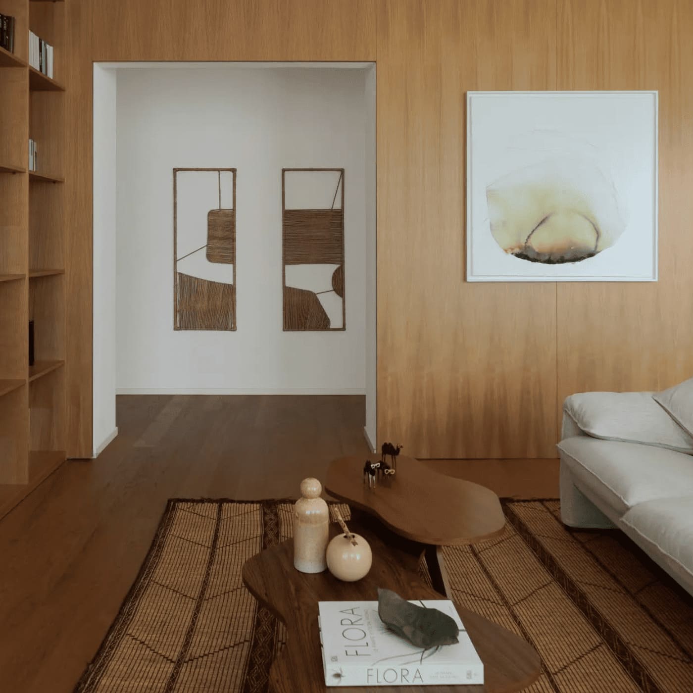
Project: Nomade Architecture
Choosing a rug is never just a matter of size or proportions. Often it is the color that determines the final effect of a room: it can harmonize, enliven, define. It is the color that guides the eye, that dialogues with floors and furnishings, that gives style and atmosphere to the room.
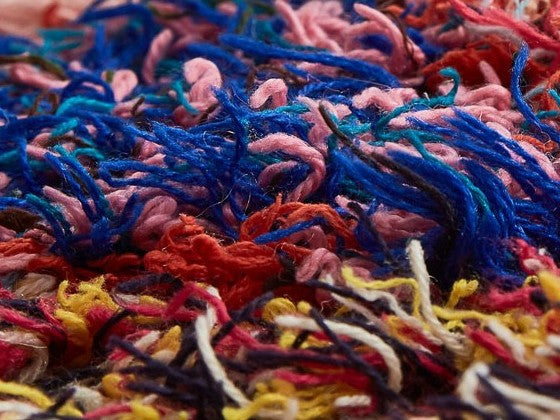
Those who follow us know: we have spoken many times about the artisanal beauty of Moroccan rugs, their history, their symbolic motifs, the natural materials with which they are made.
But today we want to focus on another aspect, more practical and everyday, but no less important: how do you choose the right color of a rug?
And how do you match it with the rest of the house – furniture, textiles, curtains, floors – without weighing it down or clashing?
Because a rug is not just a complement: it is a decorative element in its own right , which can change the visual balance of a room, giving it warmth, depth or character.
How to choose the color of the rug
When choosing a rug, color should never be considered last. On the contrary, it is often the first decision to make : because it is the color that defines the dialogue between the rug and everything that surrounds it.
A rug can have two fundamental roles within a room:
- It can be a visual bridge , an element that creates harmony, tying together furniture, floors and textiles. In this case, it works in continuity with the existing palette, helping to give coherence to the space.
- Or it can become a focal point , a presence that gets noticed, breaks the monotony and adds character. In this case, the effect of surprise, contrast, and the desire to give the space a stronger identity are played on.
There is no single rule, but understanding the effect you want to achieve is the first step. From there, you can start thinking about the type of rug:
- Solid color : perfect for environments already rich in elements or colors. Minimal but never banal, it enhances the materiality of the fleece and natural yarns.
- Bicolor : creates movement with sobriety. Ideal for those seeking balance between sobriety and personality.
- Multicolor (3 or more colors) : suitable for freer, eclectic or bohemian interiors. It requires a little more attention in the combinations, but can give surprising results.
- Neutral tones : such as ivory, stone grey, sand, dove grey… Versatile and always elegant, they adapt to any style and allow you to play with more lively accessories and furnishings.
- Bright or saturated colors : they enhance bright environments, neutral walls, essential furnishings. They are perfect for breaking the monotony and giving energy to a space.
In addition to color, decorative patterns also play a crucial role:
- Geometric patterns work well in modern, Nordic or minimal interiors, because they provide rhythm and visual structure.
- Floral or abstract designs lend themselves to more romantic or creative interiors.
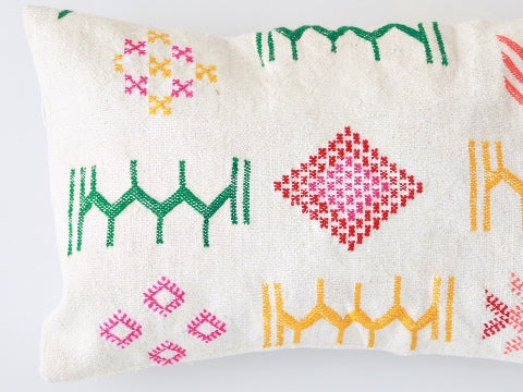
- Finally, traditional Moroccan motifs tell stories and cultures: each symbol has a meaning, each composition is unique.
If you want to know more about the different types of handcrafted Moroccan rugs, you can find everything in our guide 👉 Types of moroccan rugs: complete name guide.
Using the color wheel

If you’ve ever wondered “but what does this color go well with?”, know that the answer is not just personal taste. There is a very simple tool that interior designers and stylists also use: the color wheel . And it is perfect for choosing (and matching) a rug in an informed way.
The color wheel is based on a universal visual principle: certain colors work better together because they balance or complement each other. Here are 5 easy-to-use color schemes for decorating your home:
- Monochrome scheme
You choose a single color, and use different shades of the same color but lighter, darker or more / less saturated . It is the ideal solution for those who love visual harmony and want a refined and relaxing effect. A monochromatic rug in warm tones (such as terracotta, brick or rust) goes perfectly in neutral or boho interiors. - Analogous color scheme
Here, colors that are close to each other on the wheel are used, such as blue-green, red-orange, mustard-terracotta. The result is coherent, but dynamic. A patterned rug in shades of blue and green can dialogue well with petrol walls and sage textiles.

- Complementary color scheme
It's the game of opposites attracting : two colors that are opposite each other on the wheel are combined (e.g. blue and orange, green and red, yellow and purple). The contrast is sharp but balanced. A rug with orange accents can enhance a navy blue sofa or gray-blue walls.

- Triadic scheme
Three equidistant colors are chosen on the wheel , such as red-blue-yellow or green-orange-purple. It is the most creative and lively scheme, perfect for those who love energetic environments. With a multicolored rug, you can build the rest of the palette on two of the three dominant colors.

- Tetradic scheme
More complex but very powerful: here four colors are combined, arranged in a rectangle in the wheel (two pairs of complementary ones). Balance is needed, but if managed well it creates surprising and rich environments. In these cases the rug can act as a "visual glue", recalling all four shades and tying together very different furnishings.

💡 Tip from Casa Amar: Before choosing a rug, look at what's already in the room. What color is the sofa, walls, curtains, floor? Use the wheel to figure out if you want to stay in harmony... or create contrast.
Using the RAH Colour Method


Our Milanese living room created following the colors that represent us according to the RAH color test. Alongside neutral and wooden furnishings, we have inserted color accents in the walls and in the decor of the white rug on which multi-colored abstract lines and dots alternate. Project and credits: Nomade Architettura / photo by Simone Furiosi.
Color is personal, it is not just a question of aesthetics, of combinations, of trends and fashions.
There are colors that make us feel at home, even if we can't quite explain why.
What if your color choices were windows into your fondest memories?
Color is memory, feeling, belonging, rootedness. It is not just a preference. With RAH color consulting, we transform your happy memories into a personalized palette that reflects your personality.
And there's nothing better than a house that reflects us!
The result of the encounter between psychology, architecture and contemporary art , the RAH method is based on four key principles of neuroscience: the predictive brain paradigm, top-down processing of sensory stimuli, the approach-avoidance motivational system, and implicit associations. Through the RAH Color Test, it is possible to identify shades and tones that resonate deeply with the individual. This approach allows us to design with an unprecedented level of precision, creating visual experiences that authentically reflect the identity of each client.
How to Match Rug Color: 3 Strategies
Now that you understand how the color wheel works, it's time to apply these principles to your decor. Here are three proven strategies for matching your rug color to the rest of your room—furniture, textiles, flooring, and accessories included.
1.
Coordinated: Palette Rug
This is the safest and always very refined choice. In this case, the rug picks up the colors already present in the room , creating a sense of visual coherence. It can be identical shades (e.g. sand on sand), or different nuances of the same color.
It works particularly well in minimal, Nordic or Japanese interiors, where everything is played on a few well-balanced tones. A beige rug with hints of warm gray will be perfect in a living room with natural tones, with light woods and ecru fabrics.

An elegant living room in shades of white, beige and warm brown wood. The white wool rug with thin asymmetric black lines adapts to the predominant colors of the room. Project and credits: Nomade Architettura
The extra idea? If you already have a defined palette (perhaps chosen with an interior designer), the rug can become the common thread that unites everything else.
2.
Contrasting: A rug that enlivens or defines a space
Here we work on chromatic contrast, to give character or energy to a room. The rug becomes a “visual accent” that breaks the monotony and captures the eye. The secret is to balance: if the environment is neutral, you can dare more; if it is already full of visual stimuli, choose a strong color but in a solid color or with a discreet pattern.
In a living room that’s all light gray, a rust or mustard-colored rug will instantly add warmth. In a room with blush walls and neutral linens, an olive green or teal rug will add depth.

A living room in a traditional house on the hills of Oltrepo Pavese where the colors amaze. Yellow sofa, sky blue armchairs and a contrasting rug on the gray floor. Project and credits: Lascia la Scia
But be careful : contrast works if well thought out, not improvised. Use the color wheel to find well-balanced complementary combinations.
3.
Statement: when the rug is the protagonist
If you want the rug to be the real protagonist of the space, then do the opposite: build the environment around the rug . This strategy works very well with handcrafted rugs rich in history , such as Moroccan ones, where every color and symbol has a meaning.
Choose a rug with personality — perhaps multicolored, with an “ethnic” or symbolic pattern — and let it do the talking. Everything else should go with it: simple furnishings, neutral textiles, palettes that enhance it.

A living room where the owners wanted a one-of-a-kind piece: a rare and beautiful Moroccan mat to be placed right in the center, between the sofa and the dining area. Photos courtesy of our happy customers.
A Beni Ourain rug with black patterns on a cream background looks great in Nordic or industrial environments.
A Boujaad rug in warm, bright hues can bring life to any space where you want to escape anonymity.
Useful link : if you are looking for inspiration, take a look at our selection of rugs. They are all unique pieces: once you find your “visual base”, everything else will follow.
How to choose the color of the rug for the living room
The living room is the room where you live, welcome guests, and relax. That's why choosing the right rug - especially in terms of color - can really make a difference. More than just a decoration, the rug in the living room is a strategic piece of furniture , capable of changing the perception of space, tying together the furnishings or adding that touch that was missing.
Where to start when choosing the color of the rug in the living room?
Always start by analyzing the colors already present in the room: sofa, walls, floor, furniture, curtains, pillows. If there is already a defined palette, the rug must dialogue with those colors. If instead the environment is neutral or "empty", you can use the rug to introduce the first chromatic accent.
Use the color wheel to orient yourself between:
- Tone-on-tone palette: for soft and harmonious environments.
- Complementary or similar combinations: to add dynamism or warmth.
- Bold contrasts: to create a clear focal point (especially in modern or eclectic environments).
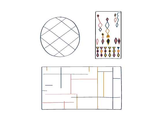
Look below at 4 examples of palettes that demonstrate how, starting from a single color, you can create various combinations. Starting from the most discreet tone-on-tone (Mono), passing through the analogous (Analogous), up to the complementary (Complementary) and the traditional (Triad) that offer often truly unexpected inspirations!
Example 1: beige palette
Color combinations for beige (tan beige HEX code #d2b48c)

Example 2: Sage Green Palette
Color Combinations for Sage Green (HEX Code #BCB88A)

Example 3: burgundy palette
Color Combinations for Burgundy (HEX Code #800020)

Example 4: mocha palette
Color Combinations for Mocha or Chocolate Brown (Mocha Mousse was the Pantone Color of the Year 2025!)

Example : in a living room with greige walls and a dove-gray sofa, a terracotta or sage-toned rug will add depth without clashing. If your living room is all-white, you can also dare with a colorful Moroccan rug , like a Boujaad or an Azilal, to add personality without weighing it down.
How to choose a rug for the living room (not just color)
In addition to color, also consider:
- The style of the rug : geometric, abstract or Berber patterns? The essential lines of the Beni Ourain go well with modern and Nordic furnishings. Boucherouite rugs are perfect for boho and creative environments.
- The material : in the living room, wool is the best choice: warm, resistant, and naturally stain-resistant.
- The format : even if here we focus on the color, let's remember: a rug that is too small breaks up the space, while a large one unites and defines it.
💡 Extra tip : if you have an open space, the rug can delimit the living area and create a real “visual island”. In this case, play with the color contrast to separate it from the rest.
What rug to put in the living room?
It depends on the style you want to give to the room:
- For an elegant and sober look , choose a rug in neutral shades (cream, grey, beige), perhaps with discreet embossed patterns.
- For a cozy and welcoming effect, opt for warm tones such as terracotta, ochre, brick or burnt red.
- If you love the bohemian or artisanal style , opt for a vintage Moroccan rug: intense colours, irregular patterns, very soft wool.
- If you prefer a modern and minimal style, a graphic rug in black and white or shades of gray is better, perhaps with Berber geometric designs.
Helpful link: Discover our collection of living room rugs selected to blend in (or stand out) in your most lived-in spaces.
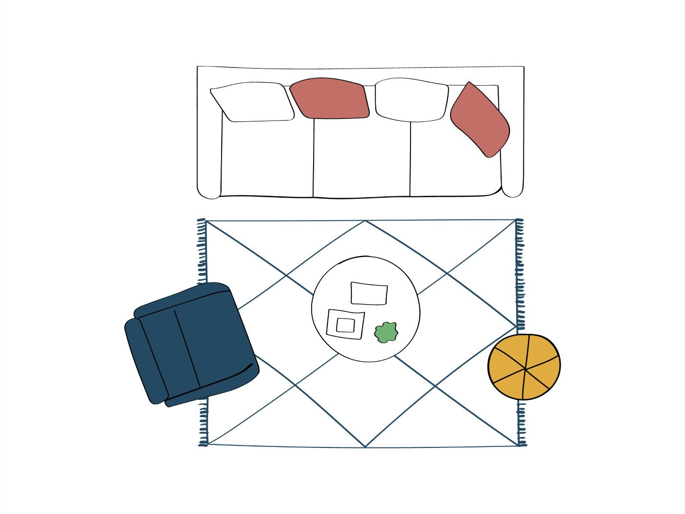
Matching rug and sofa
Rug and sofa speak the same language. Or at least, they should.
They are two of the most important visual volumes in the living room, and one can enhance (or mortify) the other. Whether you want to create a harmonious environment or play with contrasts, the goal remains the same: to make them communicate.
Here's how to match a rug and sofa in the right way, without leaving anything to chance.
Harmony or contrast?
There are two main ways to match a rug and sofa:
- Coordinate: choose colors from the same palette or with the same “visual weight”. It is the perfect choice in elegant or minimalist interiors. For example, dove gray sofa + beige rug with sand pattern; or light gray sofa + rug in pearl or greige tones.
- Contrast with style: here the rug becomes a strong accent to the sofa. It works well if the sofa is neutral (white, gray, leather) and you want to give personality with a Moroccan rug rich in color and character. The secret is to find at least one reference between the two: a secondary color, a pattern that unites them, a “bridge” pillow.
🎯 Practical example : raw linen sofa + white Azilal rug with touches of red and blue + pillows that match the rug's tones = balance and character.
FOCUS Grey – matching rug and sofa
The gray sofa is one of the most popular and also one of the most versatile. Gray is a perfect neutral base, but it can feel dull if not carefully matched.

The grey sofa is paired with a white wool rug, with central rectangular colour blocks. Project and credits: Nomade Architettura.
With a light grey sofa:
- Nordic style? Choose a Beni Ourain rug with black or beige designs.
- Want more warmth? Go for terracotta, mustard or burnt orange rugs.
- for an elegant effect: dove grey, greige or sand rug with tone-on-tone pattern.

A grey sofa with black metal feet paired with an iconic Beni Ourain: the white rug with black diamonds most loved by interior design professionals. Photos courtesy of our customers.

A grey sofa changes face thanks to the multicoloured rug and the pillows that recall some of the colours present. Photo taken by us in the GOOOders flagship store in Milan.
With a dark grey or anthracite sofa:
- enhances the contrast with light rugs (cream, off-white).
- For contemporary spaces, try a geometric rug in shades of blue, forest green or burgundy.
- if you want to focus on sobriety, play with grays in scale but change the textures: smooth sofa + long-haired rug or with raised designs.

A dark grey sofa with a white/beige rug with a beige square frame that matches the wood colour of the furniture. Photos courtesy of our happy customers :)
Advice for sofas of other colors

A melange fabric sofa paired with a multicolored rug with a patchwork-like design. For those who love to dare! Photo taken by us in the GOOOders flagship store in Milan.
Beige, dove grey and warm neutral sofa
Yes to rugs in natural tones, but you can also dare to use a touch or multicolor, as long as there is an underlying coherence. The Boujaad and Azilal, with their shades of pink, orange and ochre, are ideal for breaking up with elegance.

A small warm white sofa with a white rug with small colorful abstract designs. Photos courtesy of our customers.
White or ecru sofa
Focus on rugs that give character: Berber motifs (more precisely Amazigh) black, intense colors (midnight blue, olive green, saffron) or artisanal patterns. White leaves room for everything, but be careful of stains: better wool rugs, easy to clean.

A refined living room where wood dominates, illuminated by a white sofa combined with a rare Saharan mat. Project and credits: Martini & Partners.

An elegant living room in a villa in Casablanca, Morocco, with organically designed curved sofas paired with a large white flat-weave rug with a light blue/blue frame. Photos courtesy of our clients.
Colorful (green, mustard, blue, brick...)
In this case, the rug must “contain” the sofa, not argue with it. Avoid rugs that are too bright or have too many different colors. It is better to choose one that picks up a secondary color of the sofa or creates an elegant contrast.
👉 Sage green sofa? Try an ecru rug with terracotta or gold accents.
👉 Mustard sofa? It looks great with dusty blue, ice gray or cream rugs.
Yellow sofa
Yellow is a strong color that requires a balancing rug. It is better to focus on rugs in neutral shades, beige or gray, or that pick up on yellow in a softer way, such as mustard. Avoid too many warm shades close together to avoid creating a “chaotic” effect.

A perfect mix&match where the patterned armchairs and the yellow sofa have found the perfect match with a natural mat with decorations of various colors. Project and credits: Atypique Design Studio.
Red sofa
With a red sofa, the rug should balance and give breath. Neutral, gray or beige rugs with small red or burgundy accents are ideal. Dark blue or green rugs can also create elegant and sophisticated combinations.

A designer sofa in terracotta red combined with a white shag rug with brown abstract lines. Project and credits: Nomade Architettura.
Blue sofa
Blue pairs well with warm-toned rugs (terracotta, ochre) or light neutrals. For a more dramatic effect, try a rug with a multicolored pattern that includes blue and complementary colors like orange or ochre.
Black sofa
Black is a bold color that calls for a rug that can lighten or play with contrasts. Light rugs in white, cream, or light gray are great for balancing, while colored rugs (red, blue, or mustard yellow) add a touch of character and vivacity.
Brown sofa / brown leather
A brown sofa pairs well with neutral and warm rugs such as beige, sand, dove gray, greige or lighter browns, for a harmonious and welcoming effect. If you want more character, opt for earthy shades such as rust or terracotta. This type of combination works especially well in rustic, Japandi or classic contemporary environments.
To create contrast or a modern touch , choose rugs in cool tones such as navy blue, sage green or anthracite grey. Handcrafted rugs with geometric patterns, such as Berber or kilim, are also ideal for adding dynamism. If the sofa is very dark, a light rug is better to lighten the environment.

A rustic house on the hills of Pavia respects the traditional charm of old materials. Exposed stone and a brown leather sofa find the ideal match with a rug in two shades of beige. Project and credits: Lascia La Scia.
Quick guide to matching rugs and sofas
| Sofa | Recommended rug | Final effect |
|---|---|---|
| Brown (leather or fabric) | Beige, dove grey, sage green, denim blue, “ethnic” patterns | Warm and natural, but balanced |
| Black | Cream, sand, light grey, gold or petrol details | Elegance with contrast |
| Turtledove | Neutral shades, mustard pattern, copper, soft orange | Soft and cozy |
| White | Any color, from neutral to vibrant multicolor | Rug protagonist |
| Yellow | Beige, light grey, powder blue, neutral rugs | Sunny but controlled |
| Red | Navy blue, medium gray, rugs with orange or burgundy accents | Strong personality but coherence |
| Blue | Cream, beige, mustard, rugs with light blue or cobalt details | Fresh, modern or elegant |
| Beige | Greige, blush pink, olive green, burgundy or neon accents (if eclectic) | Sophisticated or dynamic, your choice |
| Light grey | Dove grey, sand, white, warm touches (rust, ochre) | Chic and relaxed |
| Dark grey/anthracite | White, cream, contrasting geometric rugs | Strong but balanced |
🔗 You may be interested in : if you want to find out why Moroccan rugs fit so well into contemporary interior design projects, we talk about it in this article: "Moroccan Berber rugs: between design and architecture" .
Matching rug and floor
The floor is the canvas on which everything else rests. And the rug? The touch that transforms, softens, warms. Not only for the unique sensation of comfort that it gives us underfoot, but also for its ability to enhance or rebalance the background tones of the room. Whether it is marble, terracotta, wood or resin, there is always a rug that can make it more beautiful and interesting.
Here's how to choose the right one based on the colors of the flooring.

The beautiful Mediterranean-style living room of the ecolodge B&B "Koheilan Lodge" in El Jadida is the perfect example for those looking for inspiration for a dark floor environment (black marble, stone, dark resin). Photo taken by us on one of our treasure hunting trips.
Marble Flooring: Which Rug?
Marble has a strong identity, but can change its appearance depending on the rug you lay on it.
Gray marble flooring : choose rugs in warm tones (beige, caramel, ochre) to balance the coldness of the material, or focus on contrast with a multicolored rug .
Black and White Marble : Choose a solid color rug that doesn’t steal the show but adds depth. Moroccan rugs in ivory white, light gray, or with terracotta accents are perfect.
Pink marble (Rosa Perlino, Breccia) : focus on warm neutral rugs (sand, greige, cream) or on sage green and olive green shades for a refined contrast.
Terracotta floor: which rug?
Terracotta floors are made with clay and retain the characteristics of this material: they have a rustic and warm soul, usually associated with a country chic style. A rug can enhance their charm or tone them down, depending on the desired effect.
Red terracotta floor : ideal are rugs in natural shades (ivory, light brown, beige) or with geometric patterns in earthy colors on a light background . Blue accents are also good, to break up the look. To stay tone on tone you can opt for rugs with a large percentage of bright red, ideal if the furniture is in dark wood, perhaps with antique pieces in solid walnut, rosewood, mahogany, ebony.

A country house in Oltrepo' Pavese with a master bedroom with stone walls and antique terracotta floors. The large ivory white rug adds texture and softness without stealing the scene from the main materials. Project and credits: Lascia La Scia.
Traditional terracotta flooring : choose a rug with a light base and a decidedly artisanal decor. Berber rugs in Beni Ourain style are the winning combination to give light to these tiles, together with Taznakht and Boujaad in red-brown tones if you want to give material emphasis to the flooring. Saharan and Hassira mats are also perfect for this floor.

A country house in the Pavia area with a guest bedroom in the attic. The wooden ceilings and the antique terracotta floor are the main features, toned down by playful details such as the two-tone bed and the very colorful bedside rug. Project and credits: Lascia La Scia.
Wooden and parquet floors: which rug?
Wood is one of the most versatile materials, but rug can make the difference between a dull look and a wow result.
Light parquet (natural oak, bleached) : opt for earth-toned, mustard, rust or burgundy rugs. If the room is already full of warm tones, add a cold geometric pattern (blue/gray) to balance it out.

A refined living room with dark wood paneling is illuminated by a light parquet, gray sofa and white rug with splendid ivory shades. Photo taken by our dear customers.
Dark parquet (wenge, walnut, teak) : choose light or multicolored rugs to create contrast. Cream white with black details is a classic Moroccan rug that always works.

A living room for those who dare with colors: the dark wood floor is the backdrop to a multicolored sofa and purple rug. Another splendid photo sent to us by our customers!
Resin floors, concrete and modern surfaces: which rug?

An open space with grey resin floors and a white sofa is enlivened by a colourful rug that picks up some of the colours used for the bookcase. Photos courtesy of our customers (we were speechless when we saw how the colours of the rug matched the furniture so surprisingly!)
Contemporary surfaces, clean lines, often cold palettes. The rug can make everything more welcoming.
Concrete or gray resin floor : green light for colorful, bright, textured rugs. Warm tones are excellent, from rust to mustard, but also pastel or multicolor patterns in a boho style.
Neutral tiles : These work as a backdrop. You can go for statement rugs (with bold patterns) or go soft with a tone-on-tone rug and textured texture, like hand-knitted wool.
Retro floors: majolica, cement tiles, terrazzo, Venetian terrazzo
When the floor has bold colors and patterns like these types of traditional flooring, the rug must be chosen carefully so as not to create an overly chaotic effect. Generally, it is best to focus on plain-colored rugs or rugs with very discreet patterns, picking up one of the colors present in the floor to create visual coherence. If the floor is already the protagonist, the rug must accompany without competing : choose neutral shades (beige, greige, light gray, ecru) or tone down the contrasts by opting for natural rugs in raw wool or natural fibers (mats, jute, etc.).

A living room with black and white majolica enhanced by a rug that picks up the colors and the geometric approach, but breaking the symmetry. The effect is a very original optical. Photos courtesy of our customers.
Color combinations for every room
Each environment has different needs, but the underlying logic is always the same: the rug must communicate with its surroundings. . It can do so through assonance, creating a harmonious and coherent palette, or through reasoned contrast, bringing character without breaking the balance.
Colors and materials matter as much as shades: light woods want soft or cold tones, dark ones require light and bold contrasts. Golden or copper metals go well with warm and earthy rugs, while steel and matte black prefer cold neutrals or more minimal palettes. Also pay attention to textiles (curtains, pillows, plaids) and wallpapers: a well-chosen rug can visually connect all these elements in one fell swoop.
Living room and open space
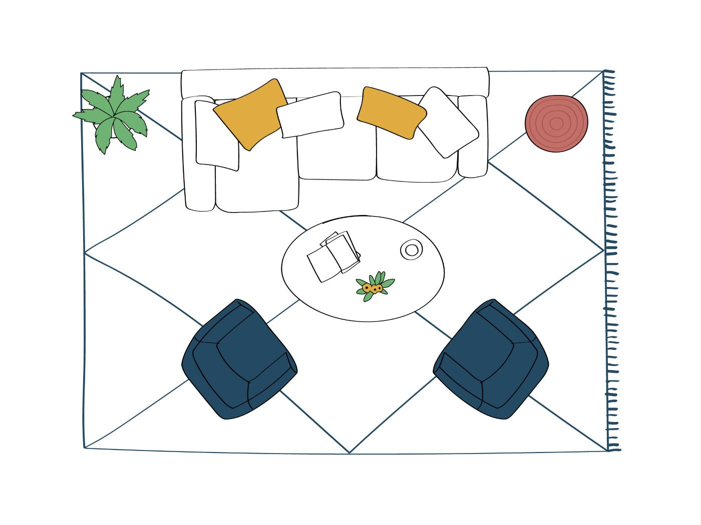
In the living room – or in the open space living area , where the living room, dining room and kitchen coexist – the rug is a fundamental ally for organizing and giving visual coherence to the rooms . It serves to delimit the relaxation space, to create a reading corner with an armchair, or to visually unite the sofa, pillows and coffee table.
The key is harmony with the main elements:
- with the sofa the rug can be in the same palette (for a refined effect) or in contrast (to give rhythm and movement);
- with pillows, curtains and textiles , it can share a colour or texture to create a common thread;
- if there is an open bookcase or an important wall, consider playing with color references;
- If the open space includes a dining table and chairs , you can opt for a second rug that dialogues with the first in terms of palette or style, maintaining coherence.
In very large environments, two well-chosen rugs can help section off the space without dividing it , maintaining continuity but also function. The important thing is that they have chromatic balance between them and with the context.
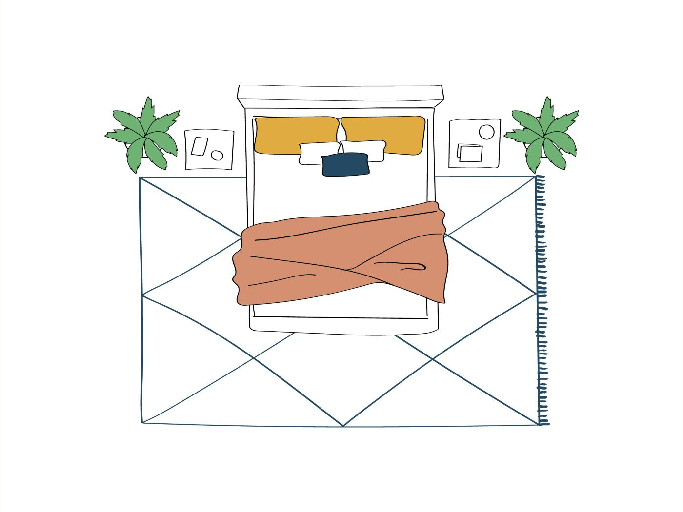
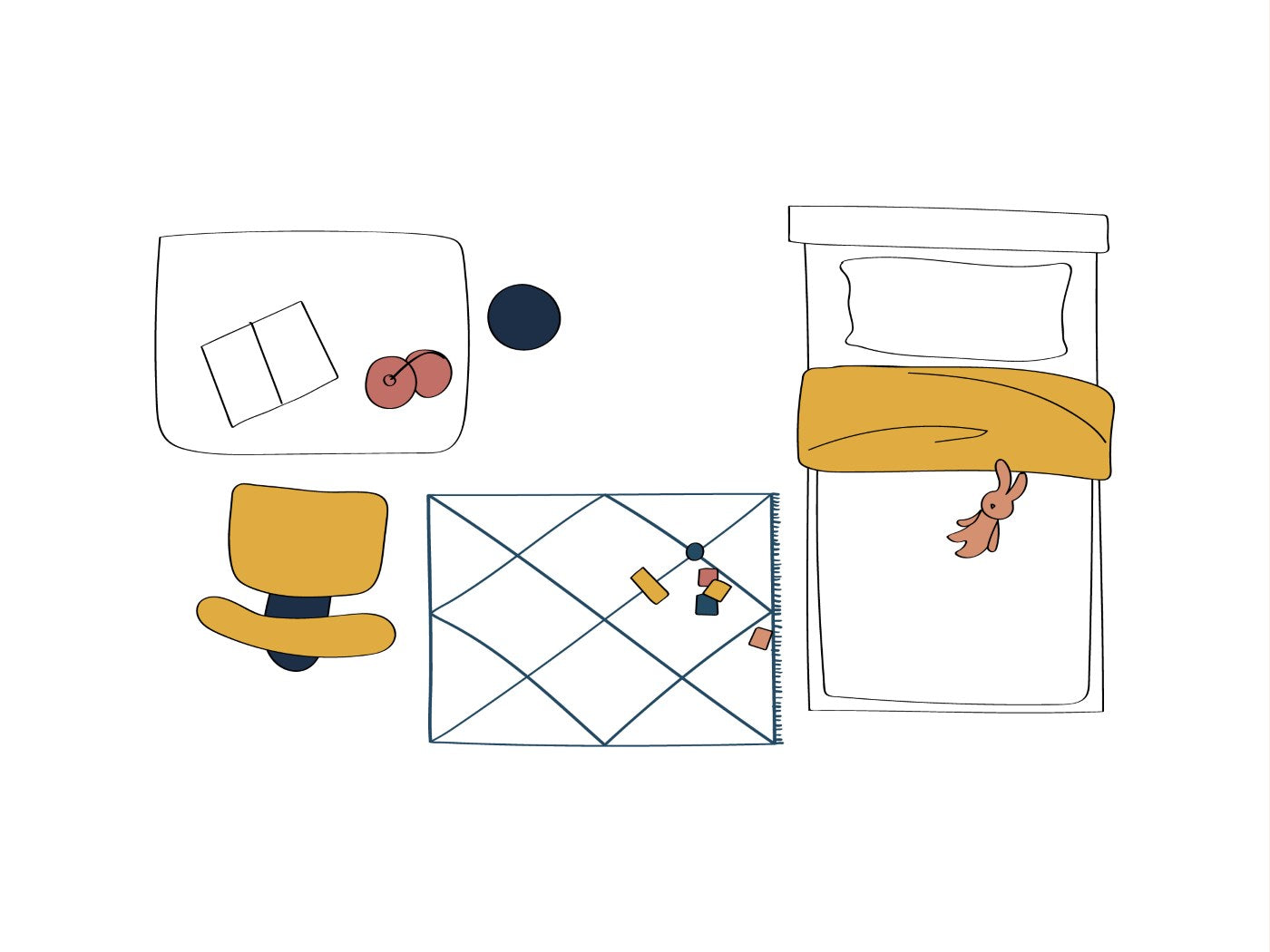
Bedroom

The bedroom of our Milanese house plays everything on a tone on tone that goes from the light wood to the beige of the wallpaper to the white of the wool of the bedside rugs. Project and credits: Nomade Architettura / photo by Simone Furiosi.
In the bedroom, the rug is not just a piece of furniture: it is an integral part of the atmosphere. It serves to visually warm the environment , muffle noises, make the first steps in the morning more pleasant. Choose one with the right tones helps create a feeling of well-being and relaxation .
They work very well enveloping and soft colours , such as beige, pearl grey or sage green, perfect for a relaxing palette and harmonious. Alternatively, you can recall the colour of the headboard or textiles, creating a coordinated effect, or use the rug to introduce a slightly more intense note , which gives depth but without breaking the balance.
The material also plays its part: soft and warm fibers are better ( wool rugs are perfect - ok, yes, we are biased!), which enhance the sense of welcome. If the floor is dark, a light rug opens and illuminates the space; if light, you can dare a deeper tone or a discreet pattern.
Finally, pay attention to positioning: a large rug under the bed frames the entire sleeping area; two twin rugs on the sides are a practical and refined choice; a long rug at the foot of the bed lengthens and balances.
Find inspiration for a beautiful Moroccan rug in the bedroom .

A room with rustic charm in a country house in Oltrepo Pavese. Furnishings from the past, stone walls and terracotta floors are perfectly complemented by a completely white rug made special by the material texture. Project and credits: Lascia La Scia.

This bedroom is a perfect example of the use of two primary colors, red and blue, which create a rich and sophisticated contrast. The preponderance of blue brings the necessary calm to the sleeping area, the red gives a touch of character and personality. Project and credits: Chantal Forzatti Architect & Interior Designer.
Bedroom

For us, a rug for a child's bedroom must be soft, handcrafted, made to last and fun without being cloying. This is Animauì: design by Oi Mini Design, hand-knotted by artisans in Morocco. Photo by Daniele Etifani.
In the bedroom the rug has a double function: warm and decorate , but also offers softness and safety for floor games and first steps. It must be comfortable to touch, resistant, easy to clean and carefully chosen also in terms of colour.
Better to focus on soft or pastel colors – from cream to sage green, from powder pink to dusty blue – that convey calm without being boring. If you want to add a lively touch, a little reasoned contrast with walls or curtains stimulates children's creativity and makes the space more dynamic.
The tone on tone combinations with textiles or walls help to create a harmonious and reassuring effect. As for patterns, it is better simple and natural : soft lines, essential geometric patterns or handcrafted textures that do not overload the environment but make it unique.
Here are some ideas for handmade rugs for the bedroom !

Our bedroom is a joyful mix of colors in which the white rug with multicolored abstract patterns finds its perfect stage. Photo by Simone Furiosi.

The striped rug picks up the colors that form the basis of this green, white and blue bedroom palette with orange/terracotta details. Project and design: Oiminidesign.

A nursery that plays with warm wood tones with a beautiful long-haired wool rug in white with asymmetrical brown, green, mustard yellow diamonds. Photos courtesy of our customers.
Kitchen and dining room

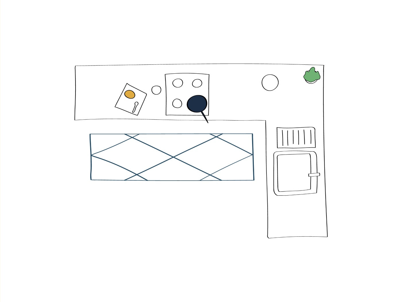
Dining area with glass and metal table, wooden chairs and large white rug with asymmetrical light blue and blue frame. The rug picks up the colors of the walls and some of the furnishings, without taking away the prominence of the fabulous herringbone floor. Photos courtesy of our customers.
In the kitchen and dining area the rug must combine practicality and aesthetics .
In the kitchen, colors that are too light are often to be avoided: it is better to focus on medium-dark shades or on multicolored runners and textures that hide stains or small signs of daily use.
In the dining area (under the kitchen table or the dining table) the final effect depends a lot on the harmony between the rug, chairs and floor . Choose whether to take the furniture or the floor as a reference point. Always keeping in mind that the risk of getting dirty here is higher than in other areas of the house, you can follow the advice we have already given you. If you have a light parquet, you can dare with rugs in deep tones (blue, rust, anthracite gray); if the floor is already dark or decorated, it is better to stay on neutral palettes or light textures. The rug, in this case, elegantly delimits the dining area and helps to create continuity between the spaces.

A long, narrow kitchen with white furniture and a pink-toned rug with white diamonds. This photo was also sent to us by customers.

The steel kitchen and the black&white majolica flooring are enlivened by the super colorful runner rug. Photo sent by customers :)
Entrance and corridor

A large entrance hall with carved wooden cabinet: the kilim rug in various shades of red, black and mustard yellow is simply perfect for a Mediterranean atmosphere. Photo taken by us on one of our research trips, inside a hotel in Khenifra in the Middle Atlas.
The rug at the entrance is your business card : it welcomes, defines and tells something about you. The color options depend on the effect you want to achieve.
Want a dramatic entrance ? Choose a rug with bold colors, a lively pattern or contrasting edges.
Do you prefer a sophisticated and discreet mood? Neutral style rugs quiet luxury (dusty grays, warm beiges, ecrus) are perfect.
In hallways, long, narrow rugs work great to give rhythm to the space . Here you can play with light geometric patterns or tone-on-tone shades that recall doors, boiserie or walls.
Here you will find a selection of rugs for hallways and entrances .
Even in the bathroom the eye wants its share

The white and blue thin striped rug is the ideal choice for a gray bathroom with light wood details. Photo taken by us in a private villa in Casablanca, Morocco.
The bathroom also deserves a touch of style. The ideal rugs are small, resistant and non-slip ( read our advice on non-slip here ). The best are neutral shades that recall the spa aesthetic: sand, light gray, off-white. These colors adapt well to both modern and more classic bathrooms, without weighing down the space.
In contemporary bathrooms you can dare a little more with elegant micro-geometries or dark rugs contrasting with light tiles, for a sophisticated look.
Caution : humidity and splashes, it is better to avoid rugs that are too delicate or light-colored if they are near the shower or sink. Or choose a multicolored rug so that stains will not be visible!
Here is a selection of rugs ideal for a sophisticated bathroom .
Ideas and inspirations for every interior style
The rug is an element that can really make the difference in defining the identity of a space. Here are some tips for choosing the right color and pattern based on the style of your home.
Minimal, Nordic and Japanese
Here, the focus is on neutral, natural and textured rugs. The ideal shades are sand, ivory and warm grey, perfect for bright and airy environments that want to avoid visual overload. The patterns are essential, almost minimalist, and the textures recall the naturalness of the materials: wool, cotton, vegetable fibres. The result? An elegant and relaxing balance.
Boho, ethnic, artisanal
This style loves rugs with rich patterns and warm, often earthy colors, inspired by the traditions of Amazigh rugs, Saharan mats and kilims. Perfect for those who want to add warmth and tell a story through their decor. Here the rug is not just decoration, but a real textile story.
Modern and contemporary
In spaces with a clean and minimal design, rugs play a more discreet but fundamental role. The most common choices are monochrome, tone on tone or with essential geometric patterns . The rug becomes the neutral base on which to enhance sculptural or organic furnishings, without stealing the scene but strengthening the whole.
Classic
The classic rug is recognizable for its oriental and kilim inspirations, with colors such as red, blue and bottle green. Perfect in environments with dark wood furniture (walnut, rosewood, ebony, mahogany, cherry) or brass details, where it can act as both frame and visual connection which unites each element as the undisputed protagonist for the simple fact of being unique and rare .
Eclectic
Here there is room for experimentation: bold combinations, bright colors, irregular shapes and layering of different rugs. The rug becomes a real artwork on the ground (or even on the wall), the protagonist of the environment and an “out of scale” focal point that gives character and a unique personality to the space.
FAQ
We thought we’d answer some of the most frequent doubts when it comes to matching rugs to interiors, so as to provide quick answers (which refer to things we’ve discussed at length above). Here they are!
🧰 How to make a handmade rug non-slip
Natural fiber rugs are never slip-resistant, they must be completed with a non-slip layer on the bottom. Online or in hardware stores there are many solutions.
Here is a brief list of the main anti-slip solutions for handcrafted and luxury rugs:
- fabric / felt underlay
- silicone or rubber underlay
- adhesive strips
- non-slip material sewn on the back (not recommended for high-quality rugs)
- Removable tapes
- nets or grid mats
Each solution has advantages and disadvantages: the choice depends on the type of rug, flooring, location and aesthetic needs.
🖼️ Matching the rug with walls and decorations: yes or no?
Yes, a well-studied combination helps to create visual harmony. You can find all the details in the section dedicated to color combinations.
🎨 How do you match a rug?
You can choose between coordinated palettes, studied contrasts or focus on the rug as the protagonist. Discover the strategies in the article.
🛋️ How should the rug be in relation to the sofa?
The rug can coordinate, contrast or enhance the sofa, depending on the style you want to achieve. Read the focus on the rug-sofa combination.
📏 How can I match the color of my rug to the floor?
It depends on the type of floor and the effect you want to create. You can find specific suggestions for marble, wood, terracotta and more in the dedicated chapter.
🌈 What color rug to put on a gray floor?
A warm-toned rug or a lively contrast is ideal to add character. Further information and examples in the flooring section.
💡 How can I choose the right color for a rug?
The color should be chosen based on the style, furnishings and desired atmosphere. Read the complete guide on how to choose the color of the rug.
🛋️ Which rug goes well with a gray sofa?
Tons of options: from tone-on-tone to bold color contrasts. See the focus on matching with gray sofas.
🛋️ What should the living room rug be like?
It must integrate with the style and furnishings, define the space and, if necessary, become a focal point. Discover the tips for the living room.
🚪 What rug should I put in the entrance?
Rugs that welcome and tell something about you, with neutral or impactful colors. Ideas and suggestions in the dedicated section.
🪟 What rug to put on a light-colored floor?
Contrasting or warm-toned rugs add depth and definition. Learn more in the section on floor combinations.
🧺 Should rugs and pillows match?
Not necessarily identically, but with color harmony or complementary patterns. Find ideas on how to do this in the article.
Mistakes to avoid when choosing the color of the rug
We're almost done, okay, don't worry. A few final considerations and a few practical tricks to avoid big mistakes. The most important thing to remember is that we're here: our advice answers all your doubts and avoids a lot of bad choices.
- Choose the color of the rug last
The color of the rug should be decided immediately, not after choosing furniture and walls. It is a key element that can tie or break the visual harmony of the room. - Ignore the overall palette of the room
It’s not enough to choose a color that “you like.” It must integrate with floors, curtains, furniture and other textiles to create balance, not chromatic chaos. - Avoid contrasts or shades that are too similar
A rug that is too similar to the floor or sofa risks disappearing and flattening the space. The ideal is a reasoned contrast or a play of tones in the same family. - Underestimating the role of the rug as a focal point
Sometimes it's the rug that needs to be the protagonist: bright colors or bold patterns can give character and define the style, especially in neutral environments. - Don't consider functionality and practicality
Too light or delicate colors in high-traffic areas or where there are children risk ruining easily. Better to focus on resistant shades and stain-hiding textures. - Don't use the color wheel for safe matches
The color wheel is a valuable ally in choosing harmonious combinations (monochromatic, complementary, analogous). Ignoring it can lead to unconvincing choices. - Choosing rugs that are too small or disproportionate
While it may not be the main focus of this article, remember that the rug should be proportionate to the space to really enhance it. - Ignoring the style of the furniture
A rug that is too decorated or too simple risks clashing if it is not in line with the general style of the room (minimal, boho, classic, etc.).
By following these simple rules you will avoid many of the most common mistakes and will be able to really enhance your space with the right rug.
In conclusion
Choosing the right rug - we are sure that by now it is very clear - is never a casual decision, but a real exercise in style and sensitivity. Investing in the perfect color means enhancing every room in the house, creating a harmonious and deeply personal space.
Experiment with balance, courage and awareness: the rug can transform a room, becoming that detail that makes the difference.
If you are still undecided or want advice tailored to your project, Don't hesitate to write to us: we are always ready to help you with personalized advice.
Let yourself be inspired by our proposals for designer and collectible rugs , for a unique and refined touch in your space.

Taroni Collection, photos by Cortili (Laura Fantacuzzi - Maxime Galati-Fourcade)
For a truly personalized consultation, we remind you that at Casa Amar we also offer the RAH consultancy service.
Our support is always tailor-made, because we only want happy customers who want to choose the right rug without risking wrong combinations. We help you evaluate the colors, materials and style of the rug in relation to the existing furnishings, the floor and the atmosphere you want to create.
Just send us a few photos and a description of your space: we will respond with targeted suggestions and curated selections directly from our catalog. A little big help to make the right choice with confidence — and in style.
![Come posizionare i tappeti in casa [con esempi pratici stanza per stanza]](http://casaamar.it/cdn/shop/articles/tappeto-salotto-divano-moderno_d21699bc-9f60-4a85-8795-9d6861f2e82c.jpg?v=1777551514&width=2048)